>>I second that of Frost... I haven't seen those ones before.. ;o
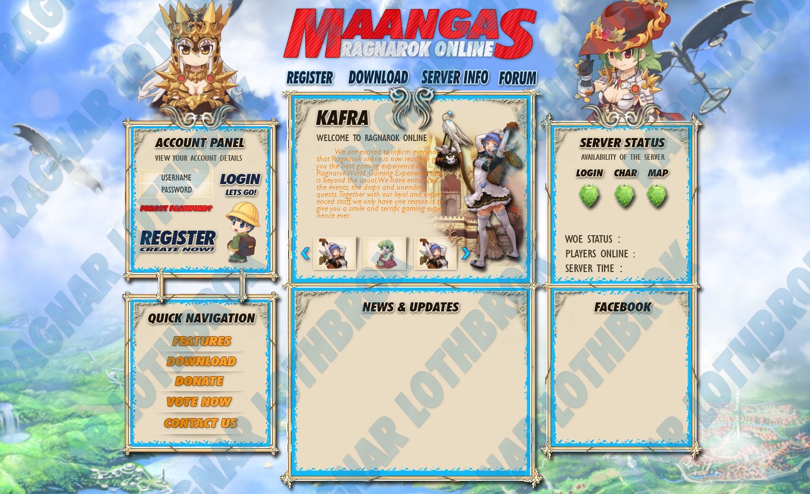
Also, at your design. I say it's missing a name in the middle... or at least something... right now it's open space and it's killing my OCD :< I like the fading you did with the kafra though.
lockquote>Do you mean Server Name on the top? actually it has, i only remove it..
Thank You!
>8/10
for your 1st design. too wide i estimated its 1400+pixels and can't read the introduction message. btw, Nice work!
Thanks
gantz!
really too wide? the dimension is 1630x1650, i don't know what is the best dimension for website
, can you please tell me what's is best dimension for website?
 , comment and suggestions are much appreciated!