


Panallox
-
Content Count
2 -
Joined
-
Last visited
-
Days Won
4
2 Followers


Recent Profile Visitors
3643 profile views


-
-
-
-
-
-
-
-
-
-
Version 1.0
946 downloads
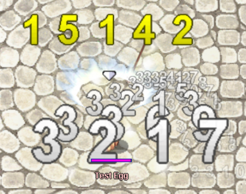
Hi all, This is a basic damage font alternative which can be used to bring a little more high definition resolution to Ragnarok! I made this purely because I was tired of staring at the hideously stretched and over-pixelated damage numbers while I was doing some testing. Feel free to give it a try! There is a slightly wider spacing between digits that I wasn't able to close off because the client must determine spacing/positionings between, but if you want to reduce some of the spacing I have provided another .act file suffixed "_larger" which reduces the spacing but makes the damage text a bit larger. Thanks -
View File High Definition Damage Font Hi all, This is a basic damage font alternative which can be used to bring a little more high definition resolution to Ragnarok! I made this purely because I was tired of staring at the hideously stretched and over-pixelated damage numbers while I was doing some testing. Feel free to give it a try! There is a slightly wider spacing between digits that I wasn't able to close off because the client must determine spacing/positionings between, but if you want to reduce some of the spacing I have provided another .act file suffixed "_larger" which reduces the spacing but makes the damage text a bit larger. Thanks Submitter Epoque Submitted 03/30/19 Category Sprites & Palettes